


- 48North
- AAGO
- Act Against Fascism
- Act Track
- AFM
- Archaeologies LA
- Ascari
- BAO
- Beanstory
- Büro Klaus
- CAFF
- CEE
- Ciudad
- CPSG
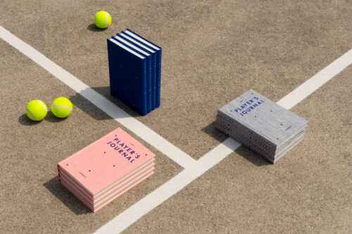
- District Tennis
- Duawalla
- Echoes of the Land: Winemakers of Portugal
- El Zanjón
- Experience Brampton
- F32
- F8
- Førs
- Førs Digital
- Førs Packaging
- GMM
- Graydon Herriott: A Dream to Build On
- Hess Academy
- Impossible Toronto: On the Courtyard
- Joyà
- Kalach TAX
- KOKO
- Laboratorio Para la Ciudad
- LAT
- LAT Digital
- Living Beauty Inc.
- Lucha: A Tribute
- MAMC
- Mason Studio
- Maximo Bistrot
- MOCA: Fall 2023
- MOCA: GTA21
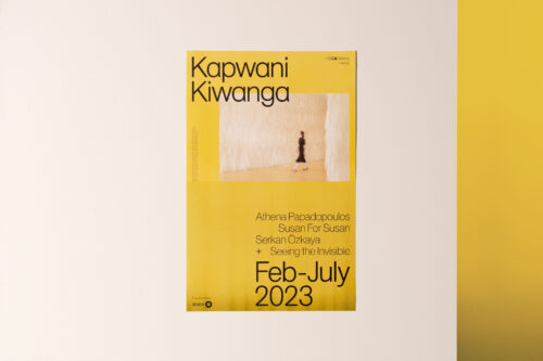
- MOCA: Kapwani Kiwanga — Remediation
- MOCA: Spring 2025
- MOCA: Thomas Demand — House of Card
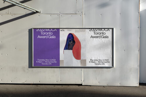
- MOCA: Toronto Award
- Modrec
- MUT
- Neptis Foundation
- Nienkämper
- Noa
- Nota Bene
- NU
- Origen México
- Oskar Group
- P360
- Rhythm Dialogues
- Ryuko
- Summerhill Market
- Superkül
- Superkül Digital
- Territoria
- The Broadview Hotel
- The Civic
- The Frederick
- The Playlist Co.
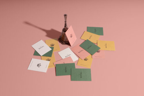
- The Royal Hotel
- The Royal Hotel Digital
- Think8
- This is Not a Toy
-
TIFF - Trapholt Museum: RÅW
- Tre Mari
- VUHL
- Wayward Arts
- WCC
- White Ribbon
- Workshop
unearth blok.
Since our beginning, Blok has worked with an unwavering belief in design’s potential as a catalyst for change. We help organizations unearth their purpose—and make it visible: collaborating with thinkers and creators from around the world, taking on initiatives that blend cultural awareness, our love of art and humanity, to advance society and business alike.
We work across mediums including:
Strategy + Positioning
Brand Strategy
Brand Architecture
Brand Guidelines
Brand Voice
Naming
Communication + Content
Editorial Direction & Design
Content Development
Photo Direction
Identity
Visual Identity
Art Direction
Creative Direction
Packaging
Product Design
Digital
Website Design & Development
Experience + Environment
Experience Design
Exhibition Design
Environmental Design
Wayfinding & Signage


